All grad students (should) study graphic design
← HomeTricks I have learned, code I have written, and free help to make your manuscripts better.
I wrote a limerick describing the experience every graduate student gets to.
Reviewers don’t even read the text,
So making the plots pretty seems like a hex.
But the preprints I’ve seen,
So seldom are clean,
And the clean ones increase your h-index.
If Twitter announcements increase the citations of work, making the content visually pleasing has to do even more. am not even entirely convinced that the figures are the single important part of making a paper aesthetically pleasing, but making the whole package right is crucial for acceptance and for people to cite your work. The science of first-impressions definitely goes beyond just people and into work, websites, and all of the content we consume.This post is half brain-log of the tools I have made during my PhD and half an ode-to design every graduate student should keep track of.
A field of first impressions

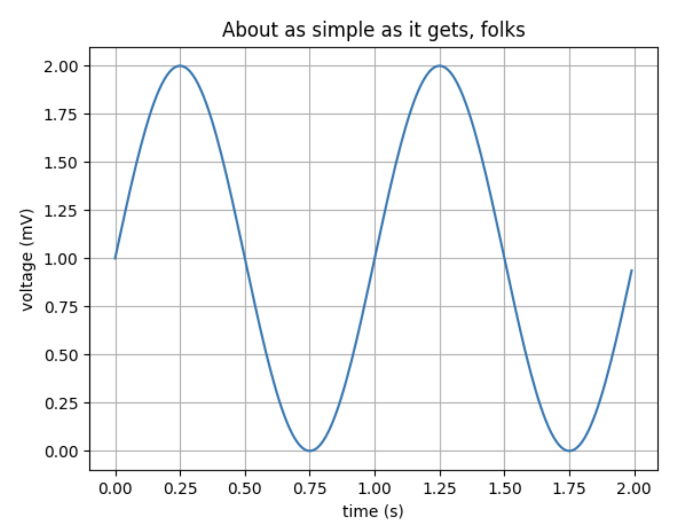
Having a unique plot scheme is like having a unique website. The first time someone sees it they will think “oh this is cool” and from the second time onwards they will say “I trust this work”. It’s a sort of research-brand. When using matplotlib basics you are tying your brand to whatever papers other people have read with the same default plots (there is definitely a distribution of truth to this, but I don’t see it as something worth risking).
Make plotting primitives (I use plotly, mostly)
Figuring out what the hell is going on with python plots takes a hilarious amount of time. I have ad-hoc built a set of plotting functions I now use in every project (mostly for better and sometimes for worse).
You can find my code here. Two notable things I have added to plotly (that matplotlib does better by default):
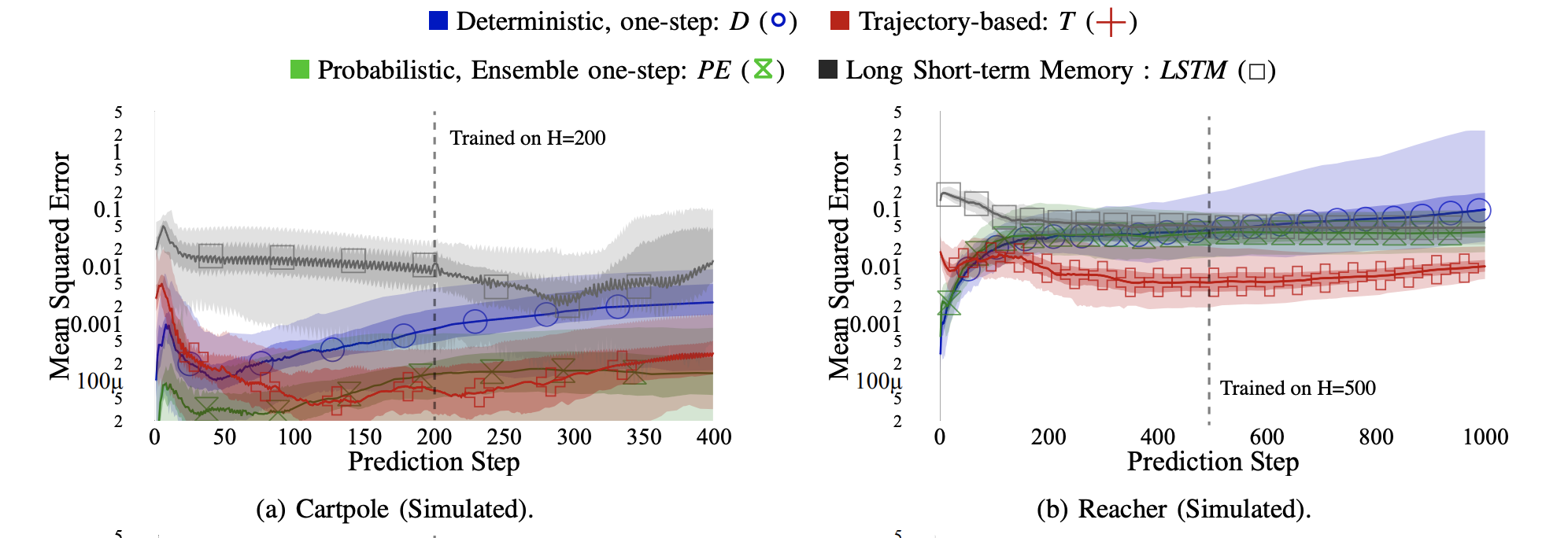
- Adding markers every n points: when you have a lot of data, you don’t want markers on every point! Doubly, you want your markers to be big and distinct. Big and distinct doesn’t work well when they overlap (note: my function also can randomize the start point so the markers are spread out.).
- Error bar line plot: some reason plotly doesn’t have error bar line plots (shaded regions). I modified code I found online to do proper error bar plots (set the quartiles you want to visualize). The different ways of doing error bars is interesting. On one hand there is mean with min and max, but that is very prone to outliers. Median with 65th and 95th percentiles tends to do pretty well!

Photoshop for your plots: Save as pdf, edit as pdf
When fine tuning a camera ready figure, open it in something like Adobe Illustrator and move the pieces around to make them look right. If you have a lot of elements you can use select > select same color to change a set of pieces at the same time. It can be easier to make your own axis labels in after effects rather than through code. This is effectively photoshop for your plots (other vector formats work too).
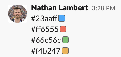
Choosing colors

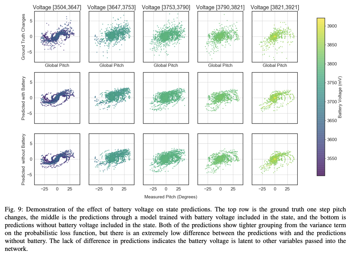
Use alpha when a plot has a lot going on. This makes the points slightly see through and adds a sense of depth to a 2 dimensional plane.
LaTeX wizardy
Not all of making a paper pretty falls into the rectangles of color. Integrating the text around the figures is important, and can take more time. This is the part of paper writing that feels like a massage.
Figure prep
A series of things should be done to your plot to make it ready for in paper:
- White background,
- Remove top & right axis lines (maybe more),
- No gridlines,
- Match font to manuscript,
- Configure aspect ratio,
- setting the axes is the only data manipulation you get! Use it!
{{ - - - - - CODE - Python - - - - - }}
fig_plo.update_xaxes(title_text="Year", linecolor='black', # account for white background
row=1, col=1, zeroline=True, zerolinecolor='rgba(0,0,0,.5)', zerolinewidth=1,)
fig_plo.update_yaxes(title_text="Market Share (%)", linecolor='black', # account for white background
row=1, col=1, zeroline=True, zerolinecolor='rgba(0,0,0,.5)', zerolinewidth=1,)
fig_plo.update_layout(font=dict(
family="Times New Roman, Times, serif",
size=24,
color="black"
),
legend_orientation="h",
legend=dict(x=.6, y=0.07,
bgcolor='rgba(205, 223, 212, .4)',
bordercolor="Black",
),
plot_bgcolor='white',
width=1600,
height=1000,
margin=dict(r=10, l=10, b=10, t=10),
)
{{- - - - - ENDCODE - - - - - }}
LaTeX Legends
Never worry about getting the legend perfect anymore, make it in the manuscript! I don’t remember where I picked this up, but I no longer make my legends in code.
{{- - - - - CODE - Tex - - - - - }}
% color packages
\usepackage{xcolor}
\newcommand{\cblock}[3]{
\hspace{-1.5mm}
\begin{tikzpicture}
[
node/.style={square, minimum size=10mm, thick, line width=0pt},
]
\node[fill={rgb,255:red,#1;green,#2;blue,#3}] () [] {};
\end{tikzpicture}%
}
% Some symbol packages for markers
\usepackage{amssymb}
\usepackage{fdsymbol}
\usepackage{wasysym}
\begin{center}
\small{\cblock{0}{0}{200} Deterministic, one-step: \textit{D} (\textcolor[rgb]{.0,.0,.78}{\large{$\circ$}})\quad
\cblock{200}{0}{0} Trajectory-based: \textit{T}
(\textcolor[rgb]{.78,.01,.01}{$\bigplus$})
}
\end{center}
{{- - - - - ENDCODE- - - - - }}

Making your text look right
Some tips for things to avoid in your manuscript:
- hanging lines in section titles,
- wide variance of paragraph lengths,
- figures coming well after their reference in text,
- citations can be wrong — have a consistent format of venue (either with or without the conference abbreviation).
You can download an example preamble for LaTeX here. It has clean ways to reference equations, sections, etc. and basic math operators like absolute value, vectors, and things to make your pdf nicer.

Wrap up
Writing papers is really a privilege (as long as you are not forcing it out the door) — it means you have done the hard work to create new knowledge, and now you get to craft it into a story. An older version of this post can be found on Medium.
I love the graphic design side of things. This doesn’t mean you need to. You need to try and make your work pleasing if you want it to be received well.